Validation Error Indicator
How to show unobtrusive data validation errors which do not mess up your layout? The adorner layer may be helpful in this case.
Introduction
Avalonia has built-in Data Validation support and also offers a way to customize the appearance of the validation message.
The default template and the one from the docs do have a significant disadvantage: these templates will change the layout. This has been bugging me for a long time, so I tried to find a better solution.
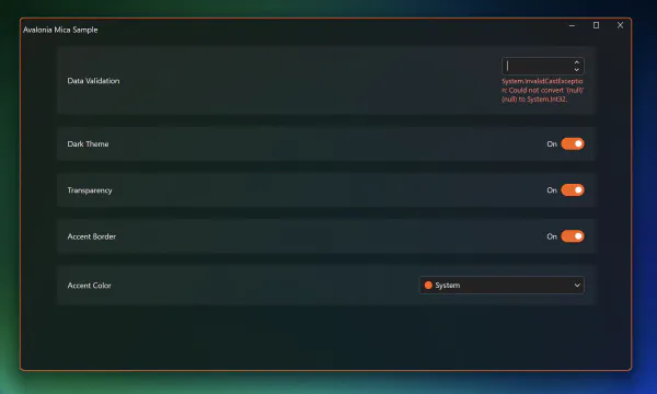
So instead of having something like this:
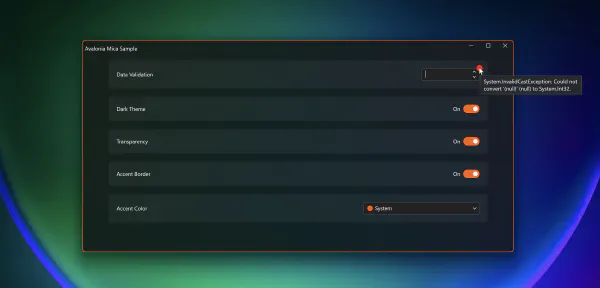
I want to have something like this:
Note that when using the default template, the height of the settings card is increased to make room for the error message. In the second screenshot, you can see, that we have an Adorner on the edge of the control which simply shows, there’s an issue. Instead of a red ellipse, you can put an icon there or even a pill shaped text badge “Error” or something. In any case, you don’t see the layout getting messed up. In my case I put the error message in the tooltip but you also could have a list of errors at the top or bottom of the page - like many web sites do.
Implementation
As mentioned before, this is done using the Adorner layer. There’s little documentation about it in Avalonia. There’s also an Adorner layer in WPF but I’m not sure if the implementation and API is similar.
In any case, there are some interesting details and workarounds. The ready-to-use sample app can be found here. I simply extended my Mica sample app and put a NumericUpDown control at the very top to demonstrate the implementation. To get the data validation error, simply delete all text in the control.
To see the behavior using the default template, go to App.axaml file and remark/remove the following line:
<StyleInclude Source="DataValidationErrors.axaml" />Using the Adorner Layer
The easiest way to create an Adorner relative to another control is the AdornerAnchorPanel from Jean-Paul Mikker on github. You only need to copy one, single file and you’re good to go.
Using the AdornerAnchorPanel
Following the docs to customize the DataValidationErrors template, simply add this XAML to the ContentPresenter which displays the validated control:
The ContentControl which displays the error can be removed entirely.
Note that the AdornerAnchorPanel offers some attached properties which allow you to control the position and offset of the control you want to draw as an adorner. In my case, the Ellipse, is configured like this:
<Ellipse
    local:AdornerAnchorPanel.ChildAnchorH="0"
    local:AdornerAnchorPanel.ChildAnchorV="1"
    local:AdornerAnchorPanel.OffsetH="-8"
    local:AdornerAnchorPanel.OffsetV="8"
    local:AdornerAnchorPanel.RootAnchorH="1"
    local:AdornerAnchorPanel.RootAnchorV="0"
    >
This basically means, use the top, right, edge of the related control. My ellipse size is 16 by 16, so with the OffsetH of -8 and OffsetV of 8, I can position it above the edge of the control.
Hack to set the DataContext
As mentioned here, there are still some issues when using the adorners. One of these issues is setting the DataContext to the controls in the adorner layer.
One way to do this is shown here:
<Panel
    x:Name="OwnerPanel"
    DataContext="{TemplateBinding Owner}"
    IsVisible="False" />
I created a panel with a name OwnerPanel and set the DataContext to {TemplateBinding Owner}.
In the AdornerAnchorPanel I set the DataContext to {Binding #OwnerPanel.DataContext} as shown here:
<local:AdornerAnchorPanel
    x:DataType="DataValidationErrors"
    AdornerLayer.IsClipEnabled="False"
    DataContext="{Binding #OwnerPanel.DataContext}">
This way you can access the data from the owner control, especially the DataValidationErrors to display the error message in the tooltip of the adorner.
Note
I know there are some changes around this in Avalonia 12 which I haven’t tested yet. This hack in particular works great with Avalonia 11.3.x as far as I know and maybe this needs some attention once v12 is officially released.
Clipping
There are still clipping issues. To demonstrate, I put the adorner at the very top in a ScrollViewer control:
What’s puzzling is, that the FocusAdorner (white outline when tab navigation is used to focus the control) is clipped correctly. Both, the FocusAdorner and the AdornerAnchorPanel are using the same adorner layer. I’m not sure why the one is clipped correctly while the other one “bleeds” through. But this is maybe a story for another time…
If someone has a solution to the clipping or has a more elegant way to set the data context in the adorner layer control, let me know.

