Mica
Make your Avalonia app look like a ’native’ Windows 11 style app supporting the ‘Mica’ background and accent color border. Sample app included!
Introduction
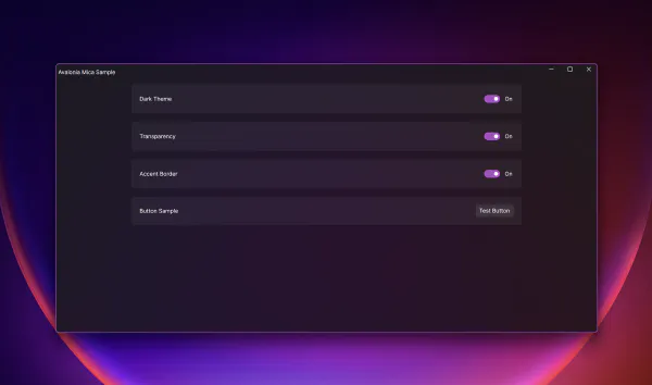
Avalonia is a great open source, cross-platform, UI framework for .net which allows you to run your app almost everywhere. Windows, macOS, Linux, Mobile, web browser, and more. If you only target Windows, or even when you target multiple OSes, you may want your app to look like a native Windows 11 app on Windows. Thanks to the powerful styling system, you can make this happen. In this blog post, I will focus on Windows and go through the steps needed to make your app look like this:
The sample application can be found on my github repository.
ViewModel
Let’s start with the ViewModel. Chances are that you want your user to change the appearance and preferences for your app, so it makes sense to handle these settings in a view model.
The sample app, allows you to change the following:
- Dark Theme allows the user to switch between light and dark theme.
- Transparency allows the user to enable the Mica transparency effect.
- Accent Border allows the user to enable the accent border in the app (independently from the OS personalization setting).
Transparency
The Window / TopLevel class has a property called TransparencyLevelHint, which we bind to the view model’s TransparencyLevelHint property.
| |
If we want to disable transparency completely, we just set the property to an empty list, otherwise we simply set a new list which has one entry: WindowTransparencyLevel.Mica.
Note
If your Windows OS doesn’t support Mica for whatever reason, of if you run the app on a non-Windows OS, the setting is simply ignored and your app will still run just fine in the “non transparency” mode.
Accent Border
The accent border color is controlled using a dynamic resource. All we do in our view model, when the user switches the accent color on or off, is setting the dynamic resource with the name UIWindowBorderColorActive to the system’s accent color when enabled or to Colors.Transparent when disabled:
| |
Note
Keep in mind, that this code does not handle accent color changes from the OS. There is an event App.MainWindow.PlatformSettings.ColorValuesChanged which should be subscribed to in order to update the color values.
Resources
To make Mica apps look great, you need to tweak a couple of control styles. You may want controls to not always have solid colors. You probably want controls to be translucent, so that the Mica background can shine through.
For this I decided to create theme dependent color resources with various levels of transparency and some color tinting. You can further tweak those colors and adapt the transparency to your liking.
Colors
In Windows, the Mica transparency is only showed on active/focused windows. That’s why I have two color resources UIWindowBackgroundColorInactive (without any transparency) and UIWindowBackgroundColorActive with some transparency.
Note
The color resources in my sample app are all prefixed with UI and depending on the color theme, I have different colors and transparencies applied on various elements (borders, backgrounds, etc.).
Brushes
After defining all the colors, I can refer to them in my Brush resources as needed using a DynamicResource binding to the color value. This way, my brush will automatically use the correct color value depending on the selected theme.
Styles
Now, let’s wire up everything to make it work.
Accent Border
All we need to do is to select the correct border (with name PART_RootWindowBorder) and set the BorderBrush accordingly.
| |
Note that our selector for the “Active” border brush also takes the IsActive and WindowState property into account. Our style here applies the UIWindowBorderColorActive dynamic resource which we set in our view model.
Mica Background
| |
Similar to the accent border, we have two style selector where the selector for the “Active” background brush also takes the IsActive and the ActualTransparencyLevel property into account.
Tweaking Control Styles
As mentioned before, you may also want to tweak control styles to use transparency levels instead of solid color brushes.
In my sample app, I created two style classes to demonstrate the effect:
Border.settingrepresents a typical settings border where we use the background and border brushes we defined in theApp.axaml.Button.settingtweaks the style for the button to use translucent background and border brushes defined in theApp.axaml.
To use the styles, simply add Classes="setting" to your border or button.
Bonus: Attached Property
In case you are wondering about the UIGlobal class and this style:
| |
Check out this blog post. In the view model there’s also this line in the OnTransparencyEnabledChanged method:
Application.Current!.Resources[nameof(UIGlobal.TransparencyEnabled)] = value;This can be helpful if you need a style selector to only apply styles when transparency is enabled.
Conclusion
As you can see, implementing and using Mica background takes some effort to make it work correctly. The approach shown above has worked quite well for me and I’m happy with the result. Once the infrastructure is set up, most of the work has to be done around tweaking the control styles. Depending on the Avalonia Theme you are using, this can take some time.
As always, feedback is welcome. Happy coding…
